Contrast plays a pivotal role in creating compelling and engaging visuals. It serves as a critical tool for designers, enabling them to highlight key elements and ensure that their work leaves a lasting impression. By manipulating contrast, creators can guide viewers' attention, establish hierarchy, and evoke emotions.
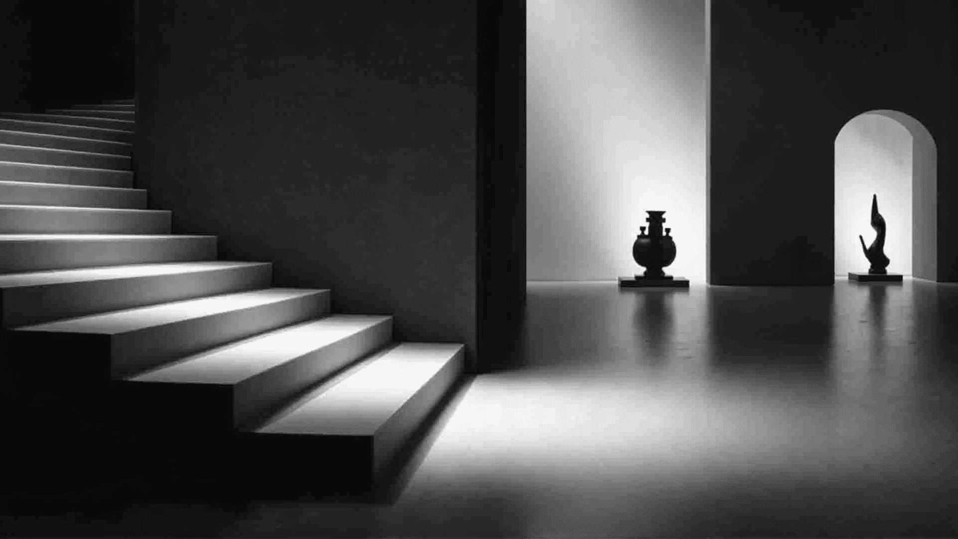
One of the most fundamental forms of contrast is the interplay between light and dark. This type of contrast can dramatically affect the mood of an image. High contrast between light and dark areas creates a sense of drama and urgency, often drawing the viewer's eye immediately to the area of sharpest contrast. For example, a light object on a dark background will stand out starkly, naturally becoming the focal point of the composition. In contrast, a gentle transition between light and dark can create a more soothing and nuanced visual experience, highlighting subtle details and textures.
Size contrast is another effective tool in visual storytelling. Juxtaposing large and small elements within a design can create a sense of depth and emphasize particular aspects over others. A larger object can dominate the visual narrative and suggest importance, while smaller elements can add intricate details that enrich the overall design. By varying the scale of objects, creators can construct a visual hierarchy that guides viewers through the intended narrative path.
Color contrast is perhaps the most immediately noticeable form of contrast. The juxtaposition of complementary colors can make a design vibrant and energetic, as opposite hues intensify each other when placed side by side. The use of warm versus cool tones can evoke specific feelings; warm colors like reds and oranges often generate energy and passion, while cool colors like blues and greens can evoke tranquility and calmness. By strategically combining colors, creators can craft a mood and impact the viewer's emotional response.
In addition to these, texture and shape contrast contribute to the depth and intrigue of visuals. Smooth versus rough textures can communicate different messages; for example, smooth surfaces can suggest modernity and elegance, while rough textures might convey ruggedness or authenticity. Similarly, the contrast between geometric and organic shapes can introduce tension or harmony, depending on how they are balanced within the composition.
Ultimately, contrast is an essential tool in the art of visual communication. By judiciously applying contrast in its various forms, creators can craft images that are not only aesthetically pleasing but also convey powerful messages and emotions. Whether through light and shadow, size, color, or texture, contrast remains key to making elements stand out and engaging viewers in meaningful ways.